I completed my clinical student teaching through Denton ISD in the Spring of 2020. Unfortunately, it was cut short due to the COVID-19 Pandemic.
However, I had the opportunity to create and implement many of my own lesson plans before my teaching experience ended. Below are the lesson I taught and galleries of student work from each project.
Color Value Scales
Elementary School | 3rd Grade
Element of Art: Color, Value
Principle of Design: Contrast
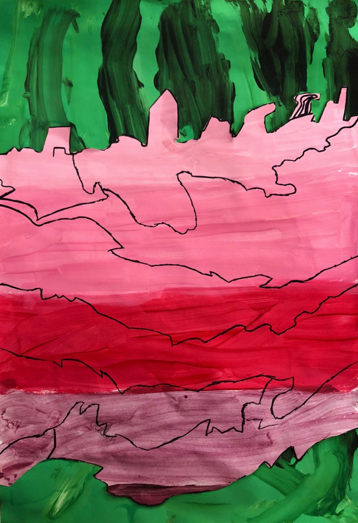
While I had originally planned for my students to assemble their color value scales in order to show the progression from tints to shades, many students wanted to arrange their work in a more creative manor. I love when students have ideas and want to express their creativity! Because they were still learning about value and showing their tints and shades, I didn’t mind if they assembled their works differently.
Additionally, I had students who didn’t want to use the complementary color scheme I posed for the project. For these students, I asked them if they didn’t use the opposite color, how would they create contrast in their artwork? My students amazed me with their answers! Some created contrast through light and dark, others with warm and cool colors.
Value Scales Project Gallery


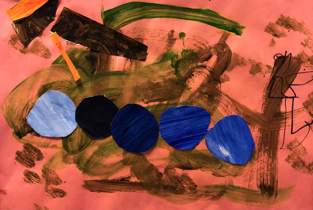


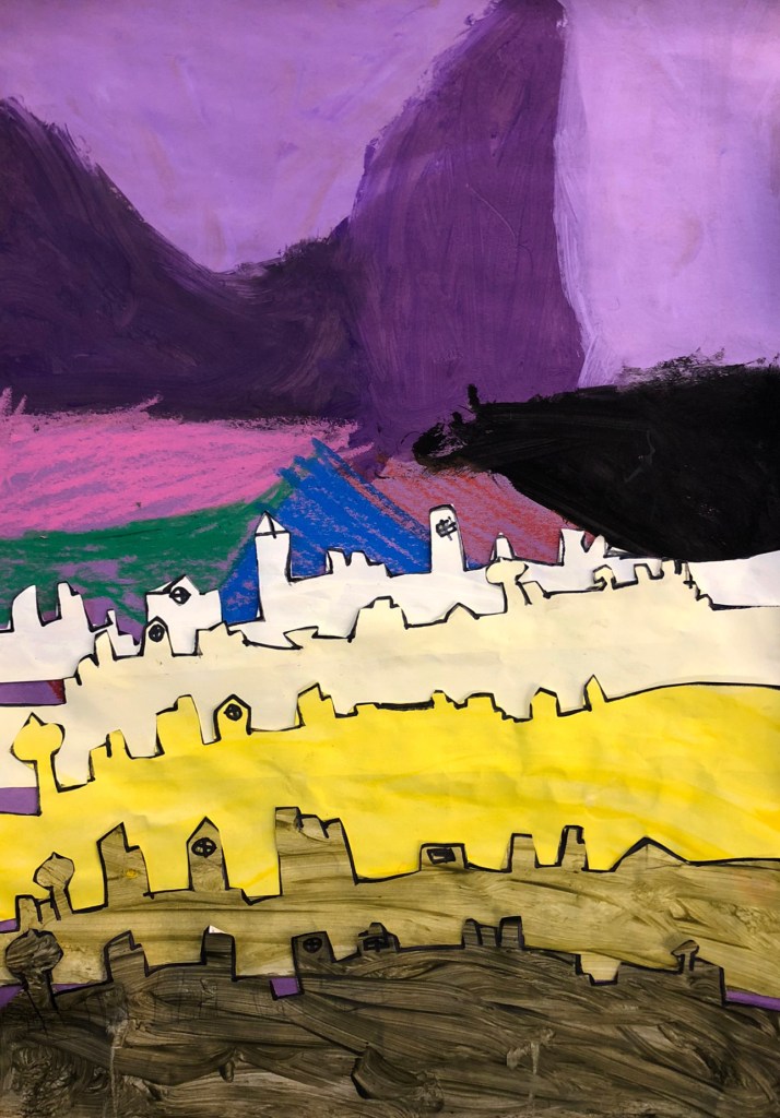
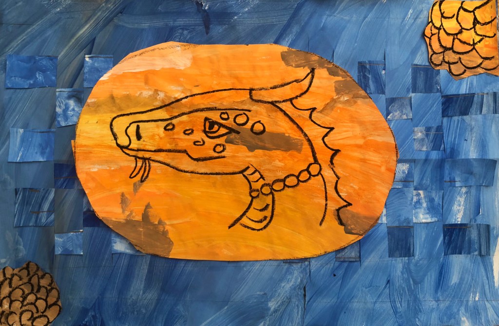
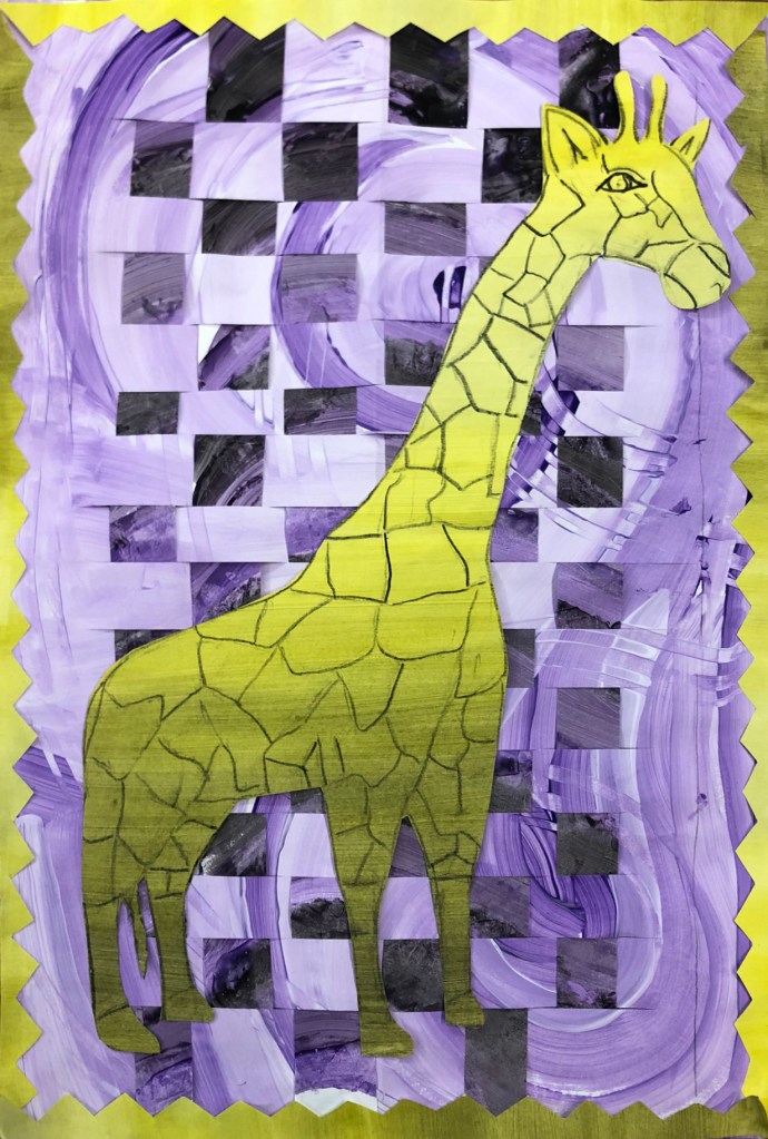
Color Contrast Weavings
Elementary School | 4th Grade
Element of Art: Color, Value
Principle of Design: Contrast
Students began the project by painting two pieces of paper using the tints and shades (value) of a color of their choice. They could create designs and paint the paper however they liked. This gave them the opportunity to explore different painting techniques. After painting the two initial papers, students painted a final, third paper in a contrasting (complementary) color.
After the papers had dried, students learned about weaving and looked at woven artworks. Then, they measured and cut their paper. Students wove in strips of paper to create the background for this project. From the contrasting paper, students cut out designs or images. Details were created using Sharpie.
Color Contrast Weavings Project Gallery


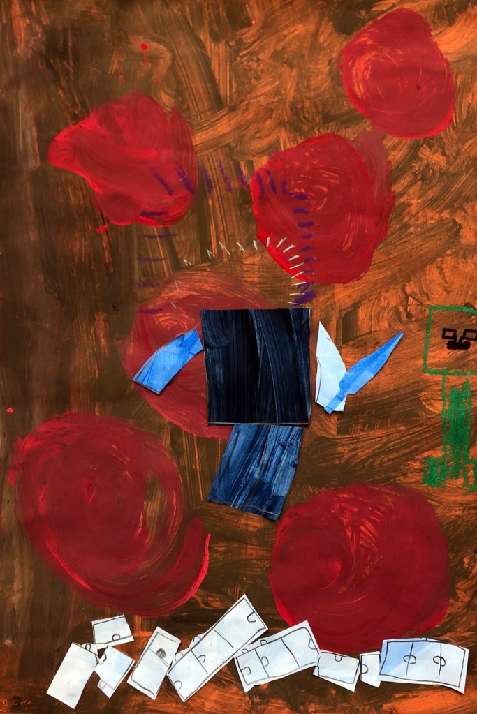
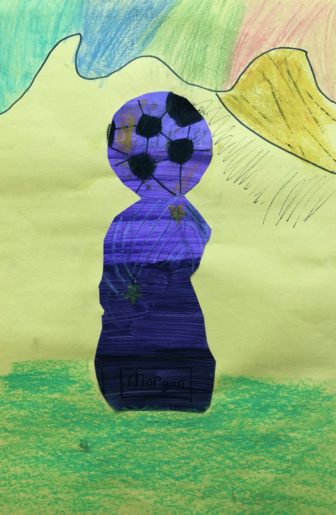
Feelings + Expression
Elementary School | 5th Grade
Element of Art: Color
Focus: Identity in Artwork
My original thought with this lesson was to make all students use black glue and watercolor. I quickly saw during my first class teaching this that my students had great ideas that didn’t necessarily fit my plan. I redesigned the lesson to be choice-based and mixed-media. I gave the option of using black glue and did a demonstration to teach my students how to use that material.
However, I allowed students to tell me what media they thought they wanted to use. I asked each student to explain to me their idea, what emotion they were expressing, and what medium they wanted to use that would best fit their idea.
Feelings + Expression Project Gallery

Day and Night, Happiness and Fear 
Anxiety and Fear 
Basketball and Sadness 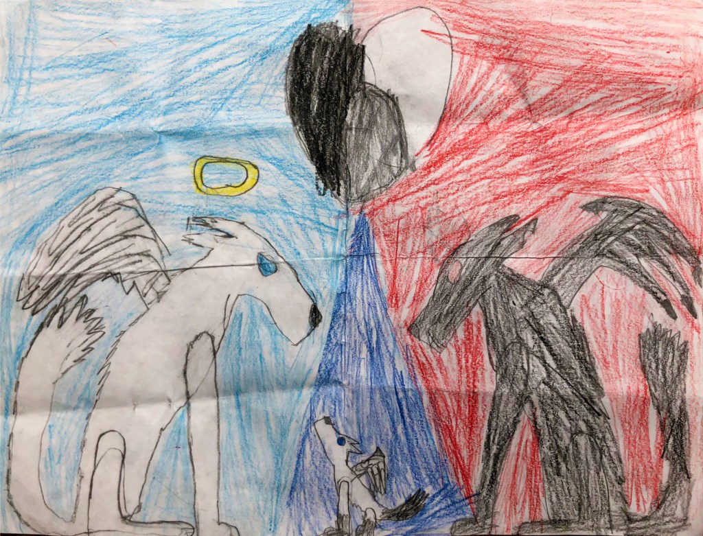
Good and Evil 
I’m Not Afraid of the Dark 
Victory! 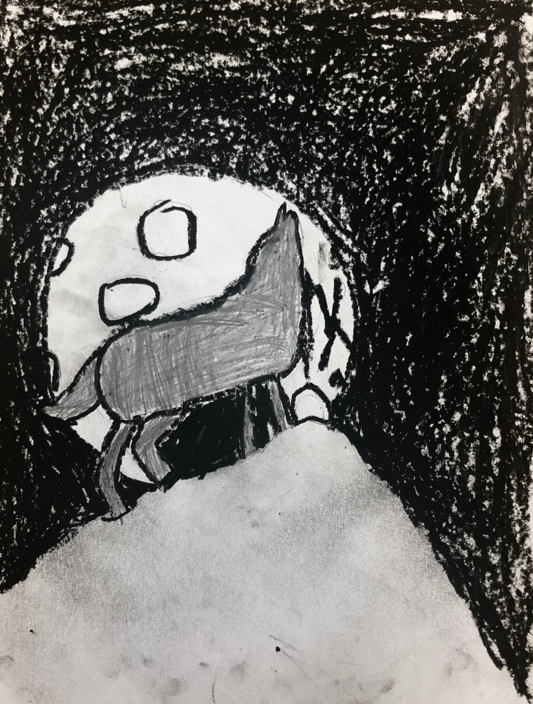
Strength 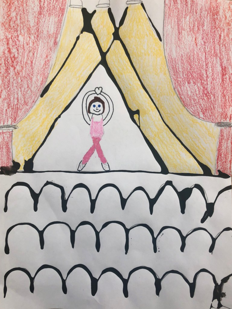
My Happiness 
Sad and Happy Town 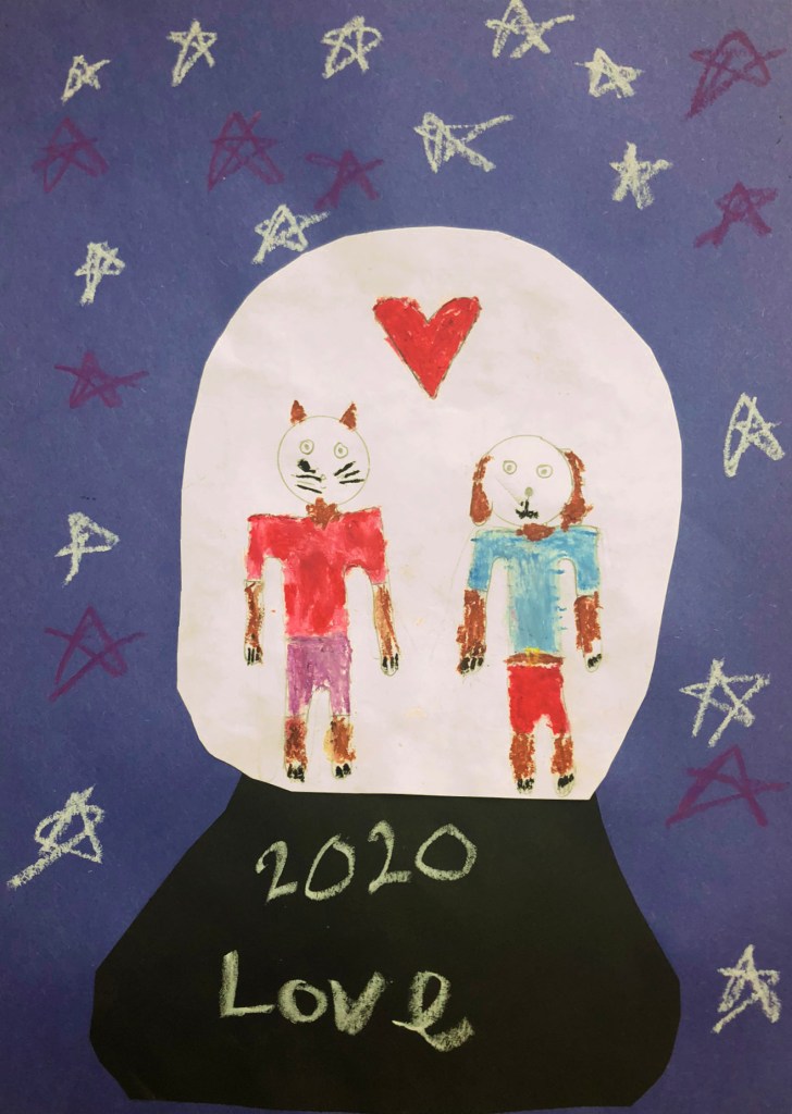
Love 
Lost 
Life After Death 
Inside My Mind 
In My Hand 
Untitled 
Happiness and Anger 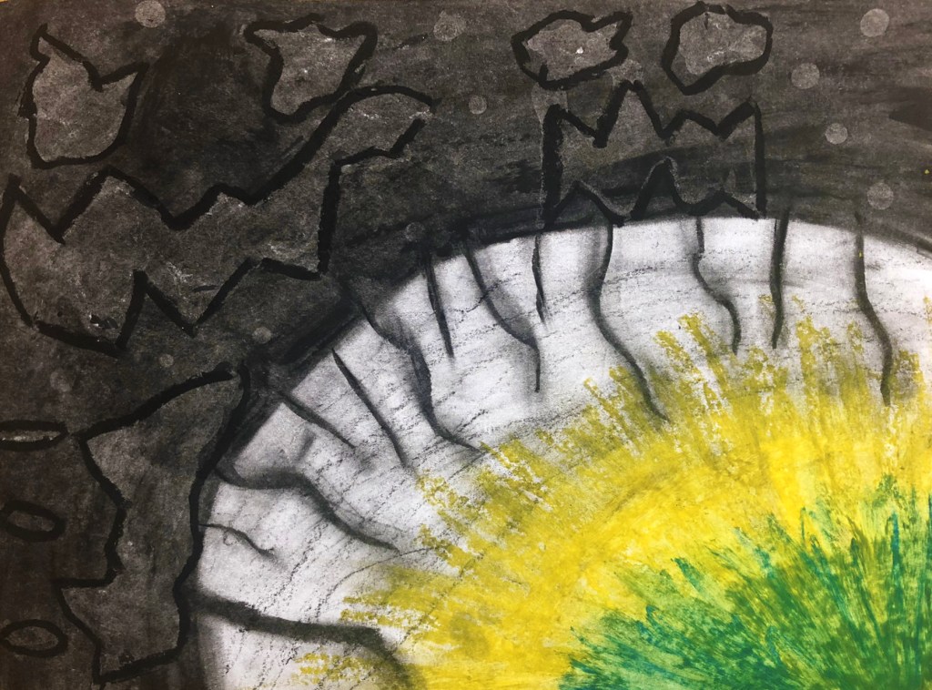
Fear and Light 
Day and Night 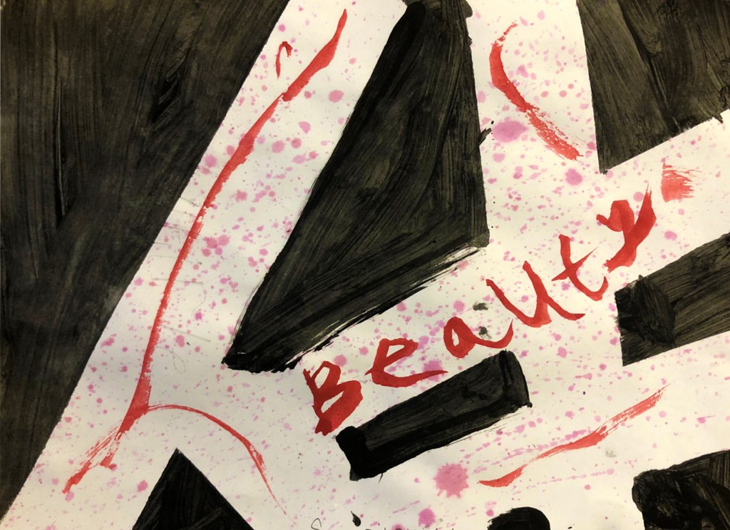
Beauty 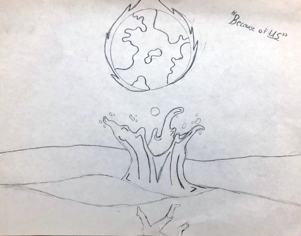
Because of Us 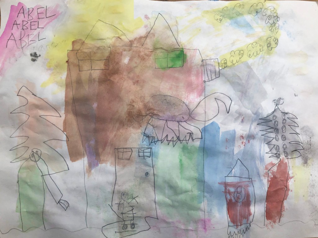
Emotions and Colors 
Beauty is Pain 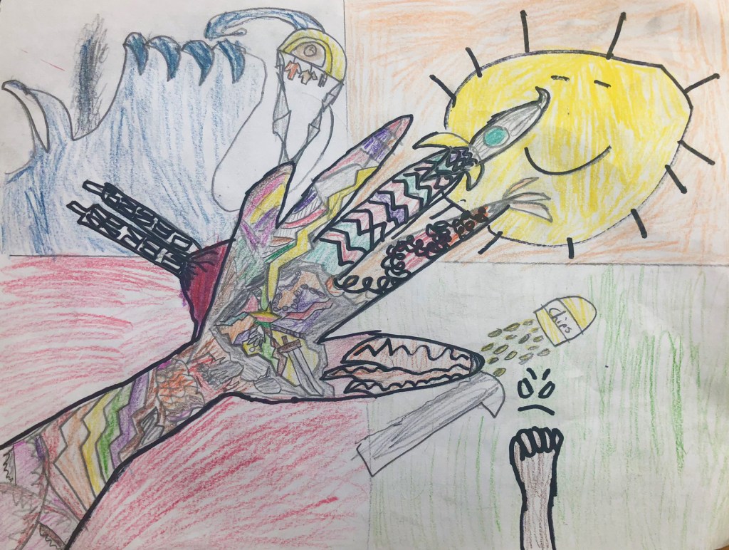
A Mixture of Emotions 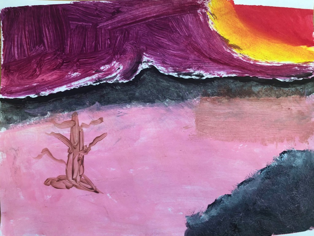
A Happy Little Sunrise
Romero Britto Hearts
Elementary School | 5th Grade
Element of Art: Color
Principle of Design: Contrast
Students learned about Pop Artist Romero Britto by looking at his work and discussing his style. After noticing the characteristics of Britto’s style and his heart motif, students designed their own drawing including hearts.
After sketching their idea, students used black glue to outline and detail their work. Once glue was dried, students used watercolors to paint inside the sections. Students were taught how to mix watercolors to achieve different hues and values.
Finally, students mounted artwork on a border and decorated the outside with black glue and other colored paper.
Britto Hearts Project Gallery
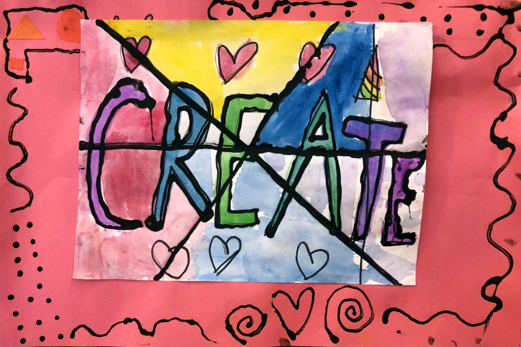
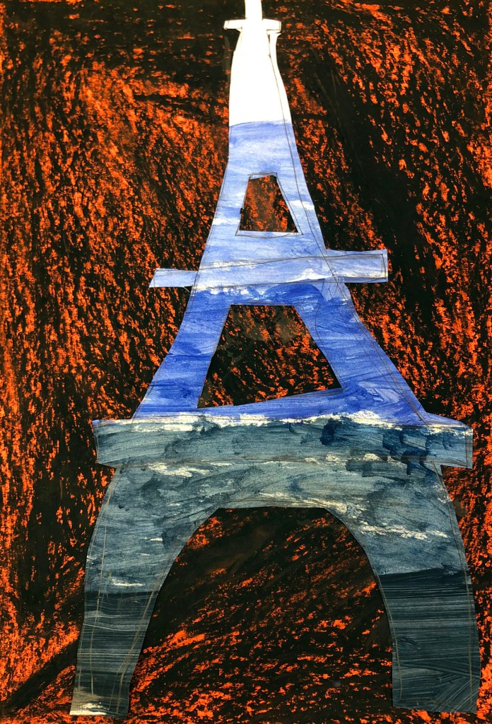
Create 
Eiffel Tower 
Happy Heart 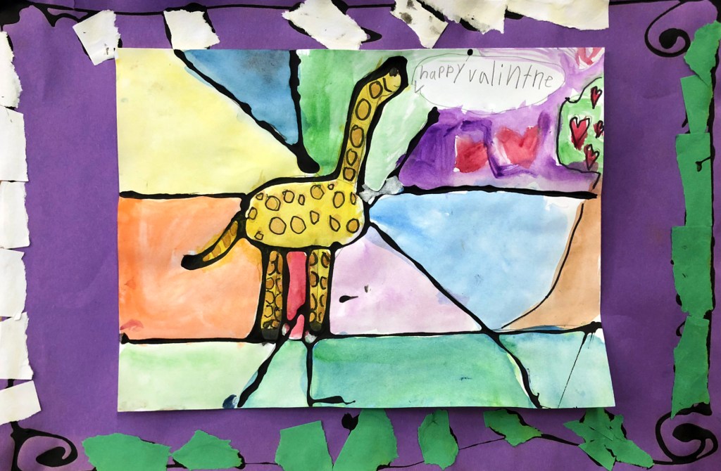
Happy Valentine’s Giraffe 
Happy Valentine’s Painter’s Pallet 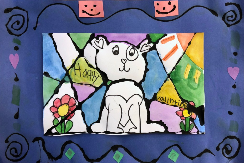
Happy Valentine’s Dog 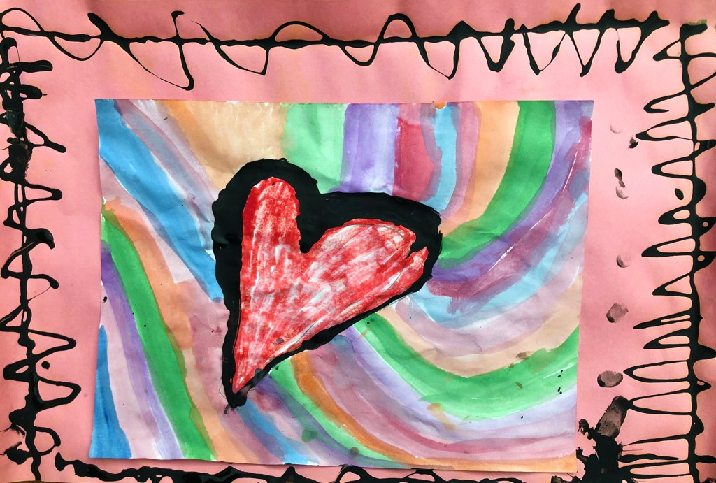
Heart with Colors 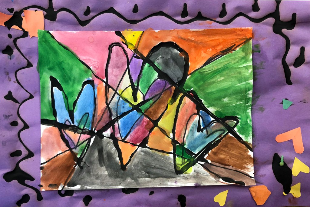
Hearts inside Hearts 
Hearts 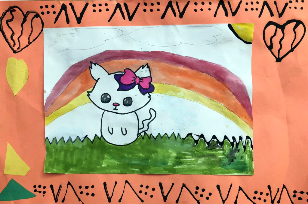
Kitty and Rainbow 
My Friends 
Pac-Man with Hearts 
Picachu 
Heart Popsicle 
Puppy Dog 
Spots the Unicorn Dog 
Swish! 
The AT-AT 
The Bulldog 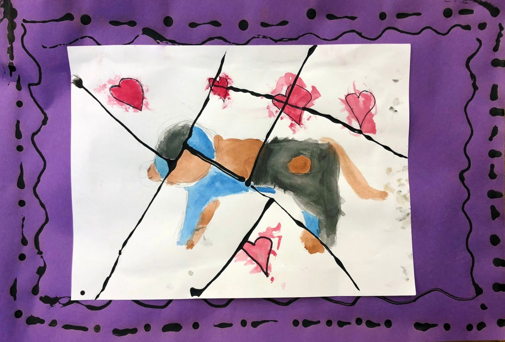
The Dog 
The Earth 
T-REX!

Leave a comment